top of page
SALT-BOX
(2024) Conceptual Brand Identity


Details
This was created solely as a passion project to explore brand identity skills.
Services
Logo Design
Brand Identity
Illustration
The Inspiration
Much like the rest of the world, I was captivated by the Hulu Original series, "The Bear." In one particular episode, a pastry chef develops a savory cannoli. My wheels began to turn immediately upon watching.
Having a savory palette myself, I couldn't help but wonder why this wasn't more common on dessert menus! More importantly, I thought how neat it could be to have an entire bakery catering to those of the public who are salty at heart!
While I sadly don't possess the skills necessary to start a bakery, I did have the ability to "draw" my dream one into fruition...
And thus a passion project was born.
The Prompt
As the ideal client for a savory bakery, I thought out what core elements would make this an attractive bake shop for someone like me.
Key Words & Phrases:
Salty at Heart. The mission to satisfy those with a savory palette needs to be obvious.
Innovative Flavors. Curated delights that put a spin on traditional baked goods and ignite the tastebuds — menu items refreshed weekly
Gourmet Quality but Affordable. Refined ingredients and exceptional food preparation with a guilt-free purchase
Artisanal
Grab & Go
Masculine
Warm
The Solution
The Name. Salt-Box encapsulates the bakery's mission: preserving traditional pastry-making, showcasing high-quality ingredients, and emphasizing savory creations. Like a salt box stores and maintains salt, the name symbolizes integrity and craftsmanship.
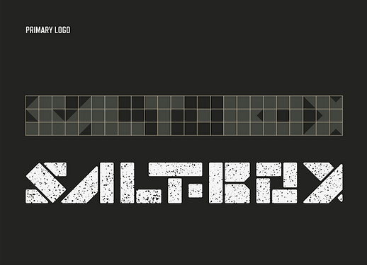
The Logo. The geometric nature of the name inspired a bold, masculine custom typographic logo, contrasting typical delicate bakery branding. I also designed a stacked version for packaging alongside badges that function like logograms — condesing the full name for tight spaces and layering elements. A salt-like texture adds in that artisanal, handmade feel.
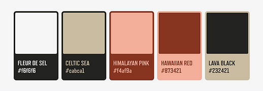
Style Choices. The color palette reflects the variety of salt hues, with warm tones to create an inviting feel and hint at rich flavor profiles. I designed two patterns to add some dimension: a subtle checkered one inspired by the logo's geometry and another with realistic illustrations to evoke a traditional bakery vibe, balancing the brand's abstract elements. These illustrations work as patterns or standalone details. Together, these bold yet approachable brand assets helped convey the grab & go energy of a bakery, not a formal sit-down restaurant.
bottom of page