top of page
DAPPLE PRO
(2023) Dapple Pro Product Design


Details
In-House Design: Jena Carlin Creative, commercial food and lifestyle photography and videography
Position: Graphic Designer
Services
Logo Design
Brand Identity
Product Design
Credits
Product Photography by Jena Carlin
What is Dapple Pro?
Dapple Pro, the innovative light modifier designed by commercial food photographer, Jena Carlin.
Unlike traditional gobos or cucolorises, Dapple Pro features patented organic edges and unique cutouts, enabling the creation of natural shadows without harsh lines or shapes. This dual-sided modifier offers versatility with one side matte black for light absorption and the other mirrored for precise control over light reflection. Also available in various sizes, Dapple Pro is versatile for any scene or scenario. With rigorous testing underway, Dapple Pro promises to be a photographer's indispensable tool in their gear arsenal.
The Prompt
With a photography style that could be described as dark and moody, Jena spent a lot of time during JCC studio shoots shaping light to get the perfect dramatic shadows. One look she was always trying to recreate was the speckling of light through leaves. Jena had tried other cucolorises, but none had ever felt organic and abstract enough. Some even would leave awkward hard edges. With this struggle, came the idea of the Dapple Pro.
Jena turned to me with this idea, and thus our journey began. Our goal was to take the simple inspiration of sunlight filtering through tree canopies and turn it into a tangible tool — a new cucoloris that could effortlessly recreate this "dappling" of light and shadow time and time again without the hassle.
The Solution
As the graphic designer at JCC, I worked closely with Jena to bring the idea of Dapple Pro to life. This was the first time in my career that I'd ever delved into the world of product design, and I was inspired by the challenge! There was so much to learn about materials, cost, safety, etc...
Several pencil sketches, illustrator designs, and plexiglass prototypes later, we finally had the perfect blend of shapes and contours. And while the final design may appear intricate at first glance, it proved to perform exactly as we hoped, melding light into natural foliage shadows.
Dapple Pro is now available to the public for pre order!
(2023) Dapple Pro Logo & Identity


Ultimus & Semplicita Pro
Adjusted spacing/kerning/ligatures
"O" filled to symbolize light source

#2e2e2f
#e6c154
#d0d86b

gradient
The Prompt
With final production details awaiting, Jena wanted to get the ball rolling in terms of advertising her new product as well as having assets ready for labeling and pre-ordering.
As the graphic designer on her team, she asked me to work on parts of the brand identity, like logo design.
In talking with Jena about goals for the Dapple Pro visual identity, we established that it should be a fusion of three things:
1. Unique Physicalities of the Modifier
2. Technical Sophistication
3. High End Product
The Solution
For the brand identity project of Dapple Pro, I aimed to create a striking contrast between the product's visually busy physical design and a minimalistic brand identity. This approach focused on utilizing negative space and elegant, simple typography to position Dapple Pro as a high-end product.
The process began with the logo design where the search for the perfect typeface was critical. The primary typeface, Ultimus, was chosen for its unique attributes: its squareness conveyed a technical feel, while its high contrast offered sophistication. Additionally, Ultimus featured distinctive negative space, echoing the product's key physical attribute. Semplicita Pro was chosen as a secondary typeface to enhance the delicate parts of the Ultimus stroke.
I developed three logo variations that felt true to building a high-end brand and that would let Utimus be the spokesperson for the identity goals.
The wordmark features Ultimus with added ligatures and a filled in yellow "O" to symbolize a "light source." The slogan "crafted shadows" was later added below to create product recognition.
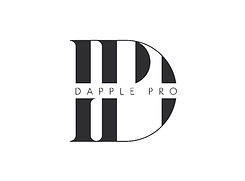
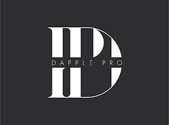
To establish a bolder high-end presence, a monogram felt necessary and it would also offer a more stand-out visual mark. I carefully combined the "D" and "P" of Dapple Pro and offered two options (one with and one without the brand name) for versatility.
I selected a color palette inspired by the three elements behind Dapple Pro's design: a deep grey for shadow, a warm yellow-orange to represent sunlight, and a bright green symbolic of foliage. A gradient incorporating these colors was added to serve as a background element and as a bolder logo option.
Additional brand identity details revolve around simplicity to maintain a high-end feel. Packaging and print materials emphasize negative space and simple typography. This was crucial because I also knew that future advertising would rely heavily on product images, requiring sufficient space for these visuals to shine.
bottom of page