top of page
HOT WATER DOCTOR
(2025) Logo & Brand Identity


Details
Freelance Project
Services
Logo Design/Illustration
Brand Identity
Stationery
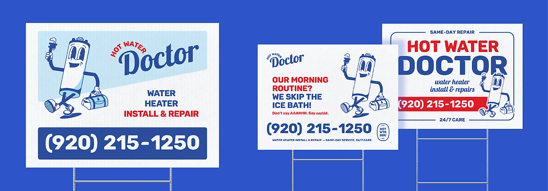
Van Decal
Who is Hot Water Doctor
Hot Water Doctor is a start-up plumbing company, located in Wisconsin, and specializing in water heater installation and repair.
Mission. Hot Water Doctor provides same-day, friendly, and reliable hot water service, restoring comfort and peace of mind with 24/7 expert care to their community.
Vision. To be the most trusted local choice for hot water system installations, known for efficient service, dependable support, and a stress-free customer experience, any time, day or night.
Core Values.
Trustworthiness
Efficiency
Caring Attitude
Any-Time Support
Expert & Quality Service
The Prompt
Summary. This project launched a fresh brand identity from the ground up, including a comprehensive logo suite and core visual system designed to build recognition and long-term brand equity in a high-demand, aging labor industry.
Key Goal. While most competitors lean on monotonous, utilitarian visuals, we set out to break the mold. We wanted to infuse the brand with playful energy and retro charm, while maintaining the clarity and directness that is essential within the industry for quick understanding of services. It was essential to strike a perfect balance between "bold & modern" and "old-school trust," helping a new business feel both approachable and established.
Main Descriptors.
Friendly/Neighborly
Trustworthy
Strong/Reliable
Energetic/ A Little Playful

The Solution
The Mascot. With a name like Hot Water Doctor, the brand needed a face! Meet Tank, the friendly neighborhood water heater. Designed in a vintage style inspired by the phrase "old reliable," Tank brings warmth, trust, and a bit of nostalgia as he gears up for house calls with his wrench and medic bag in tow.
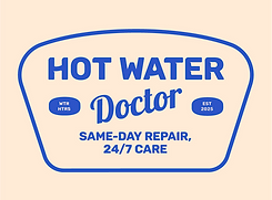
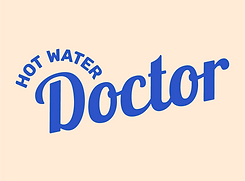
The Logo Suite. The primary logo features the retro-inspired mascot in a vertical layout that nods to vintage signage while standing out from typical plumbing visuals. The combination of playful character, bold typography, and a hint of motion conveys reliability, approachability, and timely service.
To round out the brand, a comprehensive logo suite was developed, comprising of two horizontal logos with flexible details, a bold wordmark, profile icons, and favicons. We also created a set of custom badges: compact, eye-catching marks rooted in blue collar tradition. These badges balance professionalism with a vintage edge, using monograms, abbreviations, and iconography to reflect quality, craft, and even future goals
Style Choices. The color palette blends playful personality with trust, drawing inspiration from water heater parts, the plumbing industry, and the caring feel of the medical field. Bold reds and blues reflect heat and flow, while clean neutrals add balance, clarity, and vintage charm. The typography blends a bold, header, sans serif featuring liquid-like curves with a vintage script typeface.
Together, these elements create a brand that feels fresh yet familiar. It's built to stand out, earn trust, and grow in a trade that’s ready for renewal.

bottom of page