top of page
JENA CARLIN CREATIVE
(2022) Logo Design for Brand Family


Details
In-House Design: Jena Carlin Creative, commercial food and lifestyle photography and videography
Position: Graphic Designer
Services
Logo Design (Brand Family)
The Prompt
Jena Carlin Creative (JCC) is a commercial food photography studio that also serves as major host to online food photography education, such as its blog, Little Rusted Ladle.
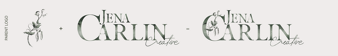
As JCC's graphic designer, my first major challenge there was revamping their logo family. The existing designs were more "clip art chaos" than cohisive brand, so I got to work. My mission? Refesh the parent logo while creating a set of sub-brand logos that looked like they belonged together.
Working closely with Jena, who had a clear creative vision, we focused on these key elements:
1. Incorporate a symbolic sprout or pea plant across all logos.
2. Keep the parent logo recognizable.
3. Unite all educational logos as an "Academy" with each having a scholarly shield vibe.
4. Embrace a hand-drawn, vintage aesthetic.
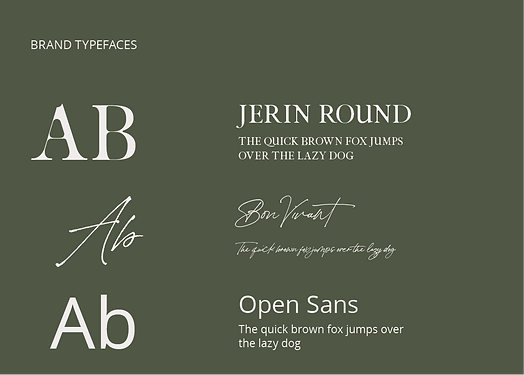
5. Carry the signature green watercolor texture throughout.


The Solution
To bring JCC's vision to life, I started by refining the parent logo, keeping its charm while enhancing balance in the stacked typography. I implemented a whimsical pea sprout motif, and the signature green watercolor texture that could be carried through the rest of the family.
Initially, I was hesitant about emphasizing a hand-drawn style, worried it might affect readability. But after discussing with Jena, we agreed that since JCC's brand is primarily online, we could lean into the artistic, vintage vibe.
For the Academy logos, I embraced a scholarly badge concept, crafting unique shields for each program that tied to the parent logo with both texture and an intertwining pea vine.
The final logo family is cohesive, symbolic, and unapologetically artistic — perfectly reflecting JCC's creative identity.
Takeaways
This project taught me an important lesson about balancing personal creative preferences with meeting a client's vision. While this work doesn't fully reflect my usual style or design process, it challenged me to adapt and think differently. The process required me to focus on creating something that aligned with Jena's vision and made her proud of her brand.
Ultimately, the experience reinforced that design isn't just about personal expression — it's about crafting solutions that resonate with the client and their audience. Seeing Jena's excitement and satisfaction with the final logo family reminded me that success in design is measured by impact, not just aesthetics, and sometimes it's ok to break the rules!
bottom of page